This is a design I did a very long time ago, but this one shown is a revision of the original I did in 1989. I used to make cassette J-Cards for myself whenever I recorded music, and I liked the design within the confines of the circle. | ||||||||||||
This is a logo I did for myself. It is inspired by the use of children's wooden architectural blocks. I like using basic shapes and integrate them with positive and negative space. The letter "M" is easier for me to design than the use of "Mc" which has been used by another famous label that has seasoning salts. | ||||||||||||
This picture is of the Hebrew word "Esh" which means, fire. I tried to stay true to the original brush strokes as I photocopied and enlarged the word. I only modified the word as such in the way that incorporates the yellow-orange dents within the letters and the blue flame which is a reiteration of the first part of the word. | ||||||||||||
This was the original idea I began with when I was helping a friend with a book cover design. She wanted something that represented fire, and given the context of this word, we both agreed it was a good start. I could use this by itself or the way it is portrayed in the graphic shown before this. | ||||||||||||
This letter "J" was for a friend of mine. I was experimenting with new graphics program and seeing how to use layers, color, filters, and repetitious patterns. I am comfortable with the overall design, and my friend liked it, too. Similarly, I did something with the Letter "K", and kept it a little more refined.
| ||||||||||||
This design, "Fish with Trish," is for a friend of mine who has a ministry in Texas. Although she did not use this design, I believe she liked the initial concept of it, and I hope one day it can be used more to her liking. Keep the faith Trisha. (Philippians 4:13)
| ||||||||||||
| ||||||||||||
I know this is really simple, but I wanted to show that I can do layout. This design is nothing fancy. It was kind of something I did on the spur of the moment. At my church they hold a Harvest Fair annually as an alternative to all of the creepy things that go on during Halloween. It is 8 1/2" x 11" on paper. Although this was done in 2000, I still like to keep it handy in case I am ever asked to make future designs. I would change it around a bit, of course. I don't like to keep things the same. | ||||||||||||
I placed this design in a previous entry, but this is how the CD art I did for my brother's former band should look. I just like the design. I know it has been used before conceptually, but I am proud of the work I did with this, "Big Poop."
| ||||||||||||
Petra has been around for a very long time. I first heard this Christian Rock band when I was about 13 years old. They have held a strong presence in my life musically, and have continued to be encouraged by them when I still hear them play today. This is a personal cover I did for myself. If I ever get the opportunity to design for Greg X. Volz, John Schlitt, or Petra as a whole, I would be greatly blessed knowing I could design for a band I listened to almost forever. They are simply the best musicians I have ever heard.
|
Saturday, March 31, 2012
My Designs Old and New.
I have been looking for work. Right now I consider myself to be an independent art consultant and entrepreneur. One of the aspects of being independent is having to rely on my own wits to find ways to connect with people. Also, I have to reinvent myself often, because it is important to change with the times and stay current. It just how I roll. It is not an easy endeavor. Sometimes it is frustrating. Creativity stagnates for me periodically, but I try to remain true to myself and keep drawing whether I feel like it or not. It requires discipline, and commitment, both which have required me to work very hard to maintain. But, I am not complaining. Many creative types have to make time for themselves to make artwork usually due to working other jobs or other aspects related to a busy lifestyle. If all I had to do each day was draw, and not worry about the other things happening in my life, I would be a happier person. My desire is to draw pictures for a living, albeit working for a company large as Disney, Marvel or DC Comics, Lucasfilm or working for myself, so long as I can be comfortable and happy doing what I love most.


Monday, March 26, 2012
Inking of you, some more.
| | | |||||||
| | | |||||||
| | | |||||||
| | | |||||||
| I recently submitted the Avengers drawing to be entered to win a t-shirt design contest at my local comic book store. This was my concept for a t-shirt, and though I know there is room for improvement, this was the style I wanted to use with an oversimplification of line a grays for use on a shirt if it wins. The winner gets bragging rights as well as his or her design on the shirt including a pair of tickets to see the new movie on May 4th. I hope I win.
| | | |||||||
| This little piece is a piece I drew many years ago, but while rummaging through stacks of old drawings I found this picture. It is something of a science fiction piece and I have names for each of these but I wish leave their names off for now. In the 1970s and 1980s I was enamored with Science Fiction art, and to some extent still am. This is a piece I will continue to revisit and add more as I have ideas to suit this little gem.
| | | |||||||
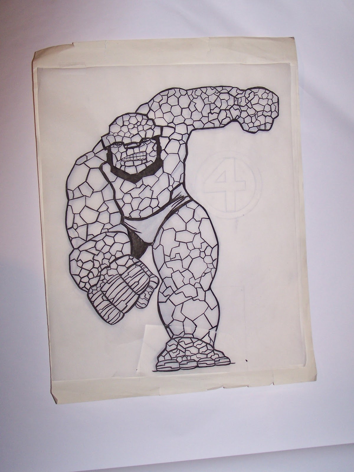
| I am a huge fan of the Fantastic Four. Ben Grimm, also known as The Thing, has been one of my heroes since I was a boy and remember him going head to head with the Hulk way back when. I was looking at Marvel's: How To Draw Comics the Marvel Way by Stan Lee and John Buscema when I made this, but it is in my own hand. In this picture, Thing is penciled with an ink overlay on tracing paper (time saver). Today I made an 11" x 17" copy of the Thing and intend to do some coloring to the picture all nice and clean. I will post an entry when I am done.
| | | |||||||
| I have posted this in earlier entries, but this is sort of a progress report. Little by little I am accomplishing this drawing. Since my last post, I have cleaned it up a little bit more, but I still have to adjust the contrast and adjust the grays. I think I mentioned, too, that one day this piece will be a mural on a wall in a home of my own, along with other comic book murals.
| | |


Monday, March 19, 2012
Inking of you.
 |
| The Silver Surfer- 10" x 14" ink on paper by Kirk McConnell after Jack Kirby |
 |
| Select Poses for practice by Kirk McConnell |
 |
| A magic elven lady by Kirk McConnell after Steve Beaumont |
The Joys of Cartooning
 |
| Superkiid (c) by Kirk McConnell 2011 after Christopher Hart |
One of the things I enjoy doing is cartooning. Cartooning is the means to let my imagination be unleashed to create whimsical and fun pictures. In this blog entry I have place some pictures I have drawn after having studied artwork from Christopher Hart's books. They are modified to my liking, but follow in the steps Hart used to draw his cartoons. I have drawn each of these on 4" x 6" note cards. I also draw on 5" x 8" note cards, too.
I started to draw these last year as a means to show kids how to draw, and to build up a small collection of drawings I can use to make and sell to passing people at some of the little art gigs I attend.
 |
| Fantastic Girl (c) by Kirk McConnell 2011 |
 |
| Zapster (c) by Kirk McConnell 2011 |
 |
| Envy (c) by Kirk McConnell 2011 |
When I draw these pictures, it seems to take little effort, and I have a lot of fun making them. Often, when I have the extra money, I will make laser copies on card-stock paper and give as gifts to friends as appreciation for help or a kindness shown.
I don't consider myself to be great, but I know people like my drawings. I am thankful for those who have encouraged me to not give up on drawing over the years. I feel a bit rusty as I mentioned I have done so many things except what I really like to do which is draw. I am starting to realize that if I am truly serious about what I want to do, then I must commit more time to drawing and draw until I cannot see straight anymore. One person recently told me it is like a musician who plays piano. They do not become great over night. Often, these musicians must practice daily for hours upon hours and keep practicing until they get their skills and song right.
 |
| Neutron Boy (c) by Kirk McConnell |
I think I used to draw a lot, but somewhere I got sidetracked. I lost my confidence too. But like the superhero who is sometimes kicked to the ground by villains who exploit his or her weaknesses, he or she rises back up to fight and defeat the enemy. Life can sometimes feel like a super villain. Sometimes life kicks me to the ground, but I get back up. I keep fighting. I don't give up. Somehow, I get this strength and repose to continue, to find balance and not let life get the better of me. (You can click on an image to see a larger version.)
 |
| Trixie (c) by Kirk McConnell 2011 |
 |
| I am a Green Lantern fan. This is one take on GL. 2011 |
 |
| Mythos (c) by Kirk McConnell 2011 |
 |
| Spiderman. I am a huge fan. Just a quick sketch by me in 2011. |
Thursday, March 1, 2012
Graphic Designs: Heroes and Faith. Part II
(Below) In the late 1990's my brother Bill McConnell and his friend, Bill Lockhart were in a local band called ETC. This was an album cover design I had made for them. There is a red version, too, but I am not going to post that since it will just be redundant. I really enjoyed their music, and sometimes wish the band were still playing today.
| ||||
(Right) Bearing good fruit is an earmark of the one who trusts Jesus. He tells us in John's gospel that he is the "vine", and we are the "branches". Jesus tells us that apart from Him we can do nothing. By that I mean, we can do nothing of spiritual importance. These qualities that we are to have in our lives is described here on this simple design and verse from Galatians 5. I don't see it like the law as revealed in Exodus, but a standard of quality that should be portrayed by anyone who follows Jesus.
| ||||
|


(Above) Okay, so the movie was not great. It failed on many levels with me, although I would not blame Ryan Reynolds who portrayed Hal Jordan, AKA Green Lantern. I think there was a major flaw with the premise of the story and too many things that Green Lantern newbies were not prepared to comprehend. I would not have used Hector Hammond or Parallax as the nemesis of the story. In stead focus more on the origin and use a different galactic villain more suitable for Green Lantern to battle. Anyhow, I won't complain beyond this, as I am still an avid fan, and hope to see what is in store when Sinestro makes his reappearance as villain. | (Below) Hawk-girl is an amazing and highly underutilized character in the DC Comics Universe. This design is a typographical experiment for me, both playful and serious, and paying tribute to one of my favorite female heroines.
| ||||
| (Left) Superman is one of my favorite superheroes. When I first saw Superman the Movie in the 1970's, I wished that I could be like Superman and save the day. The way the world is today, I think we need a Superman to fly in and sweep away all of the bad things that are making life difficult for people. In this design I inserted words that I felt best described who Superman is to me. Or is it how I would like to be? Often when I make a design, I will use an action figure I photograph and create photographic rendering in a program I use. Sometimes it is an easy thing for me, and other times not so easy, and equally time consuming. | ||||
| (Right) Iron Man is also one of my heroes. Without his armor he has no special ability save for his vast resources and ability to see possibilities of future technology. Iron Man's alias is Tony Stark, a rich billionaire playboy also gifted with a streak of super genius and creativity. I think I was inspired by previous movie posters I have seen with Al Pacino. This Iron Man design uses just a little bit of photo manipulation for the glowing eyes and other parts. I used yellow to contrast the red on the harsh black background and an imaginative flaming fiery ground . This by far is one of my favorite pieces to have made. |
| ||||
| (Left) I have to admit that I have always loved the Wonder Woman character. I fell in love with Lynda Carter when I was a young boy and which young lad wouldn't? Wonder Woman represents strength, virtue, intelligence. I think those are qualities I admire in a woman who is more than just physically attractive. In the realm of comic books she has top billing as a lead heroine, a major player in the Justice League, and sometimes a difficult choice making role model for young women around the world. Wonder Woman can be fierce, but not lacking compassion. It is why I would like to write or draw for her character if given the chance in the future. | ||||
| (Right) The Green Lantern is about overcoming fear. He is not absent of fear, he just knows how to manage the things that make him afraid. It is this acknowledgement in my own life that makes it possible for me to advance even now in the midst of things that are causing me anxiety as a result of fear. This design is one I am fond of simply because it reminds me that I can overcome my fears. In away, I think of this as a self-portrait, not how I really see myself, but imagining that I can be a hero too. Green Lantern, if I haven't mentioned, would be one of the other characters I would either like to write stories for or to draw. "In brightest day or blackest night no evil shall escape my sight, let those who worship evil's might beware my power, Green Lantern's light." -motto |
|


Subscribe to:
Comments (Atom)